With today's mobile responsive WordPress themes, the look of your website on a mobile phone is more important than ever and certain considerations should be put into your website design for mobile phones.
How does your website look on mobile? Easy to view? Easy to navigate? Perhaps there are some occasions that you may want to hide a video, images or anything else on a mobile phone to make it more user-friendly.
Sometimes you may want to hide certain things on mobile phones only.
Here is how to hide any website content from a mobile phone only.
From your WordPress theme, you can either add this to your themes CSS editor or add this code directly to your stylesheet, (style.css). You can also add it directly to your HTML in HEAD the section. (One or the other, not both.)
Once that is saved to your stylesheet or websites HEAD section, the rest is really simple.
Around the text/image/video that you would like to hide from mobile devises, add the code highlighted in yellow in front and behind the section from your HTML or Text Editor. (In other words, don't add this from the visual editor)
<div class="mobileHide">Text/Image/Video That is NOT for Mobile</div>
There ya have it, happy mobile hiding!
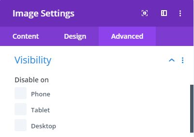
PS. Depending on what WordPress theme you are using, all of this extra coding can be avoided by using Divi Theme.
They have a built in editor that you can change what is visible or not visible on PC, Tablet and Mobile.

About the Author:
The SEO-Alien is a project started in 2009 regarding all things online marketing. The site started out more of a diary of predictions, suggestions and references to things I frequently used for online marketing... before social media marketing was even an option.
I hope you find the information and tools presented here useful and something worth sharing with others.
If there is anything else about online marketing or any online advertising strategy you think would be helpful, please let me know.


