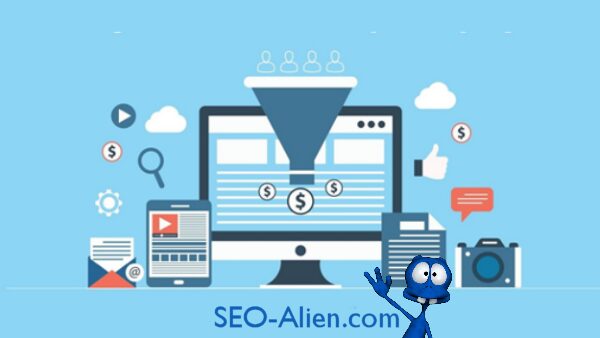
In eCommerce marketing, a conversion is anything that is considered a positive move towards the buy button by a user on your website.
One of the most important metrics that you need to have at the tip of your fingers at all times, the conversion rate is the ratio of visitors who converted to complete a particular action.
Here's everything you can do to improve your eCommerce Conversions.
Homepage Optimization
The homepage is the first thing a visitor sees on his journey to becoming a loyal patron. Space must be inviting and simple, much like the lobby of a grand hotel. Encouraging them to look around and explore is key to having a guest feel welcomed. Keep these notes in mind while designing your homepage:
1. Simplify the Experience
Creating a simple, visually appealing page with a highlighted brand message is the first step in creating your image online. A good website pays extra careful attention to the UX and is not an information-overload. Excessive text and messages are a big no-no and instantly turn the customer away from your website – whether your product range is right and what you have to offer that suits his liking. Any other information is unnecessary.
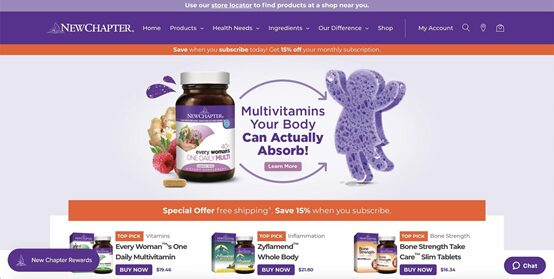
Source: Newchapter
2. Coupon codes, real-time purchases, and more
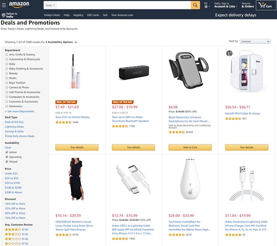
While it’s okay to keep things simple, it doesn’t mean you become boring. Make use of your webpage to display a dedicated space of products that are on sale, much like a brick & mortar store. You can also use an appealing announcements bar/corner to share coupon codes and promotions. If you have an email marketing campaign running (highly recommended), make sure that you collect the address in exchange for surprise gifts! Another way to create a bit of zing is to show real-time purchases on a little corner.
3. Add testimonials to build trust.
The trust factor is a vital part of the eCommerce experience. The problem is that you are in the same alley as thrift shops and scamsters unfortunately. You have to provide the Downtown experience and make yourself stand apart. If your products have been featured in use by influencers or you’ve been in the news, make sure that you put it out on the homepage. Use a tool like HotJar to understand how your visitor’s clicks travel around on the website. If they’re scrolling down more than clicking over to the products page, they’re looking for validation.
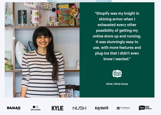
Source: Shopify testimonials
Product Discovery Optimization
Once the buzz has done its job, it’s essential that the visitor can navigate well in the products page to find what is to their liking. A smart and well-designed products page is half the battle towards the buy button in eCommerce.
4. Use intelligent search
A critical aspect that often gets ignored, due to the simplicity issue, a search button is the best gift you can give to a dedicated customer. If they’ve come to find something in particular and they need to scroll through pages and pages of products to get there, the chances are that you will see increasing bounce rates. Apps like Findify and InstantSearch provide intelligent search tools, including suggestions.

Source: Amazon intelligent search
5. Organize your categories effectively
Logically structured product categories are fundamental to allow users to grab what they reach for easily. Using 4-6 main categories and several subcategories are visually more appealing. But in a bid to simplify, make sure that you don’t create confusion by having products fit into multiple subcategories. You can use your site's internal search data to figure out how you can name your shelves better.
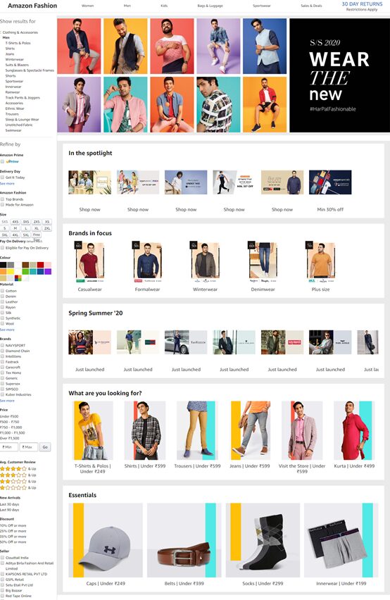
Source: Amazon Categories
6. Take Advantage of Your 404 Pages
Sometimes it does happen that a particular product has been discontinued or removed. While it is not ideal, it is an opportunity for redirection. Provide useful links and promos on your 404 pages rather than leaving it blank.
7. Add a Shoppable Instagram Feed
Instagram has become the most valuable platform for creating a brand image. Optimal usage of posts and stories features can bring your customers closer to you. Having a Shoppable Instagram feed allows you to cash in on a potentially bored/easily impressed window shopper. A perfect example of user-generated content in action, Millenials prefer the simplified experience that comes with Instagram shopping.
Product Pages optimization
Once your product categories have done an excellent job of creating a visually stunning, easy-to-use display, it's time to provide a good cover to the books on your shelf. And trust that you will be judged by the cover.
8. Use high-quality product images
A significant drawback of the online commerce experience is the absence of any sense apart from sight. With this in mind, it becomes the primary source for building appeal. Using high-quality images and videos that display your product in use is key to building a trust quotient with your customer. You should also provide product images in multiple angles.
9. Price, delivery time, and out of stock products
A vital part of building trust is that there is no misleading information on your website. Building frustration may not lead to immediate closing of the website window, but it will make it that much harder to get your customer returning. Unexpected shipping costs are the reason for 28% of abandoned carts. Keep in mind that your customer may simply be willing to pay more for the product itself rather than the shipping.
10. Showcase your product reviews
Yet another essential measure to take for those who look for validation, adding an unaffected star rating can go a long way in building confidence for the product. You can also go a step further and ensure that you provide informative reviews that speak about the individual parts in a kit. Doing so will also provide a tone of genuineness to your site. 90% of customers say that product reviews influence their decisions.
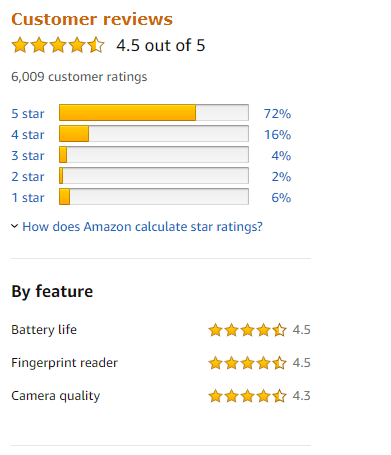
Source: Amazon Product reviews
11. Add a curated Instagram feed
Many consumers have caught the trail of ingenuine reviews due to bad experiences. If your product falls more on the expensive side or has many options, the chances are that many visitors may look around for social media reviews. Having a curated Instagram at a corner of the product page can help those who are leaning tilt all the way.
Checkout Experience Optimization
One of the final steps on the journey towards a purchase, keeping a straightforward checkout experience is key to upping the conversion rate. More than 60% of buyers indulge in the abandoned cart phenomena. Keep these suggestions in mind, and you’ll be far better off.
12. Pre-fill your customer’s information
Autofill options from social media accounts are key to driving business up – customers have noticed a 200% increase in conversion rates after linking with social media profiles. Maintain customer accounts so that it gets easier for repeating customers. When it comes to loyal and returning customers, you should always look into minimizing clicks and typing to make for a faster checkout experience. Over a third of customers abandoned carts in 2016 because of a complicated checkout process.
13. Send Abandoned Cart Emails
Abandoned cart emails are the crux of email marketing campaigns. It is imperative that you send out emails at strategic times like the holiday season and weekends to have some of those customers returning to your page. Make sure you do it in between other campaigns and not just repeatedly send out abandoned cart emails, as you may end up in the spam folder.
14. Optimize your thank you/order confirmation
Customizing your Thank you mail and personalizing them is important in completing a total checkout experience. You can use the thank you letter to provide promos or even have them sign up for a newsletter. Some companies also use analytics to suggest other products that the buyer may be interested in. The most important aspect of the order confirmation mail is to provide them information about where the product and when it will arrive.
Shipping and returns Optimization
The last part of the checkout process is where the final countdown begins. First-time buyers may be most skeptical about clicking on the buy button. The frantic feeling of paying in advance by card doesn’t end until the product is in their hands. It’s crucial that this anxious feeling is acknowledged and taken care of.
15. Offer free shipping
One of the many good alternatives to price slashing is free shipping. Instead of handing out coupon codes willy-nilly, first-time customers may be more interested in cashing in on free shipping, especially if your products are available in brick & mortar stores. The most crucial aspect that eCommerce works on is convenience. Product-based shipping prices are the most ideal. Free shipping for a minimum purchase also works great for some eCommerce models.
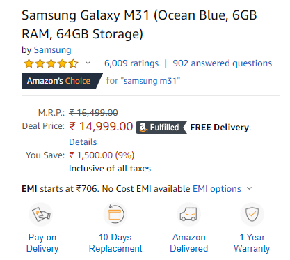
Source: Amazon product page
16. Have a definite refund policy
If you have products that offer different sizing options, there should even be a defined refund policy for the same. Place it upfront and centre either on the product page or on the checkout page. More than 50% of customers read the return policy before going for a purchase: clear, concise and honest plans are fundamentals when building confidence.
Additional Information
When it comes to eCommerce conversion rates, every page on your site counts. You have to stay up to date with the latest trends so that you are on par with competition at all times.
17. Tell a story with your about page
An important one that often goes amiss, the about page is the only space you have to build a human element into your eCommerce platform. It need not be emotionally evoking, it can merely be a few funny lines about your team members, but it puts a face behind the mask, and that is a crucial part. An about page also gives you an SEO opportunity that is oh-so-important for the SERPs.
18. Create a comprehensive contact page
Most site owners will not realize the importance of a contact page until they see a negative review online that says “Return blah blah blah. No one to get in touch blah blah blah”. The automatic conclusion would be that you are a scam. Provide a way for customers to reach out to you, and you’ll see for yourself how your customer engagement stats will skyrocket. A comprehensive contact page includes an email address/contact form, physical location if available along with hours, social media links and support-specific contact options. If you can offer more discounts for bulk orders, put it out in bold on the contact page.
Website Speed and Performance Optimization
None of the above CRO strategies will show good results if your website is limping. Bounce rate increases by 40% if your page takes more than 3 seconds to load. High-performance sites result in high returns and higher SERPs inevitably.
19. Make sure your site is mobile responsive
A responsive design simply means that your website looks great no matter what device it's viewed on. Mobile users hassle when they have to go back-and-forth, zooming in on product images and scroll. It is vital in such a scenario to have your UI/UX optimized. More importantly, it is also the very reason that you need to keep the homepage simple. Nobody likes to see a site filled with text on a small screen. Large images are essential. One should also note that Google is moving towards mobile-first indexing, meaning that a non-responsive site will lead to a fall in the SERPs.
20. Optimize your website loading times
A HubSpot research states that a 1-second delay results in a 7 percent reduction in conversions. A few ways to evaluate loading times are by using Google Insights Tool and Pingdom. Another way to increase the speed of your website is to compress the pictures.
Conclusion
Having this information handy while designing your ecommerce website is key to improving the business. If you think you are falling short on many aspects and are not sure which ones impact you the most, start one step at a time, and test the waters regularly.
Additional Resources
- The Average Website Conversion Rate by Industry
- Cost-Per-Conversion: What is it? And how to optimize it?
- How to do Conversion Rate Optimization to your shopify store?
- 19 eCommerce Marketing Trends that are Dominating 2020
- How to create your first Shopify Store?
- How to get more traffic to your Shopify store?
About the Author: AdNabu
AdNabu helps improve sales in Google Ads for eCommerce companies. If you are running search, shopping or display campaigns in Google Ads, Their software will be able to increase your sales. Sign up today for a 14-day free trial from here.


