
After you have gone through all the preparations we have discussed in our "How to Create Awesome Marketing Videos" series, now it is time to to choose a font.
This post will dive into a number of tips regarding text when designing your presentation.
Video Marketing Strategy Series
Part 4
When to Use Uppercase vs. Lower Case Fonts
One of this first things you will have to decide on is which font you will want to use. For starters, make sure to use uppercase letters for short titles and not complete sentences, as this makes them harder to read.
If your presentation is online and the text is readable by Search Engines, you probalby dont want to use and uppercase, because it is rarely picked up by Google, as it is considered SHOUTING.
Best Presentation Font Sizes
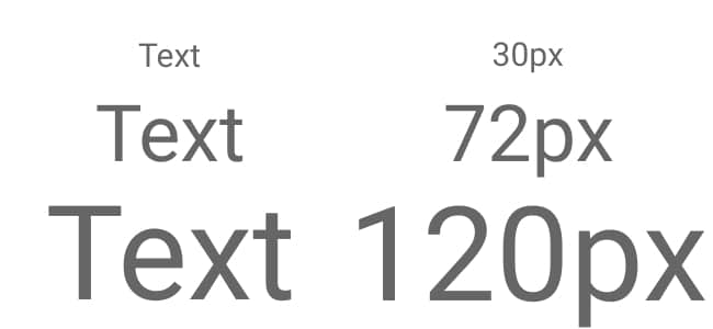
Another consideration is the point size. Business guru Guy Kawasaki also advises to use text with a point size no smaller than 30.
For larger venues, such as a TED conference, there are presenters who use text as big as 72 to 120 points.
Font Leading
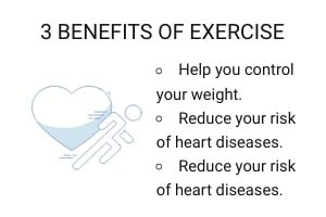
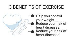
Another thing you will want to consider is the spacing between lines, known as leading. Too
little or too much space between lines can make your audience struggle to understand your points clearly.
Take a look at the images below. One has too much leading, one has too little, and one is just about right.
Using the Right Fonts
Choosing the right fonts and knowing how to use them within your presentations could be a full course in itself, but below are a few of the most important things to remember when choosing your font(s) in your presentations.
- Use fonts from the same typeface.
- Stick to two—max three—typefaces.
- Assign distinct roles to each font.
- Choose fonts with the right personality
- Avoid similar-looking fonts.
- Create the right amount of contrast.
A good suggestion would be to make a list of your favorites fonts and stick to those. Here are some of our favorite fonts: Mister Earl, Caslon, Garamond, Baskerville, Passion One, Futura, Bodoni, Frutiger, Rockwell and Franklin Gothic.
Not sure where to start? Here is a good place to browse 40 free Google fonts.
In Summary
When we first started creating presentations in 2003, learning how to best use text in digital presentations was one of the most important lessons. It is so easy to use way to many fonts, or not the right ones, and that can ruin any presentation, even if it was on the cure for cancer.
Learning what fonts to use, how to place them and choosing the correct sizes will make a huge difference in how you audience perceives your presentation. We hope this helps you build a better PowerPoint and/or Video Presentation.
Be sure to receive our future tips & tricks like this by subscribing to our new posts!



This is very interesting, thank you for this. I like the 1-6 points.